I’ve only had a business card once or twice in my life and rarely used them. But I need one now. I’m going to be publishing my books myself (gulp) and beyond that, people often meet me and ask for a way to communicate with me. I don’t usually give out my phone number, although in modern America, we have all surrendered our privacy for convenience, something I hope we don’t regret but almost certainly will.
Rather than scramble for a cell phone or pen and pencil, I need a simple business card with my contact information, at least some of it. Some people want to have lunch or coffee, others want to send me something. It’s time for a business card.
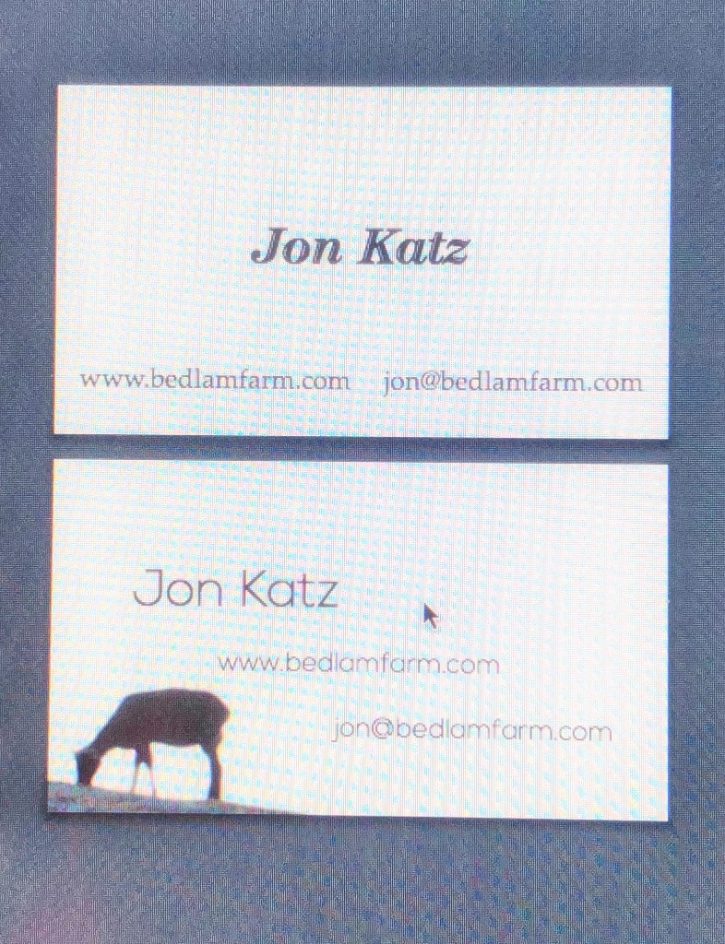
I asked Sara Kelly, a local graphic artist to design a business card for me. I asked her to keep it simple, and she sent me these two designs today.
I like the one on the bottom with the sheep very much. It’s simple but has something of an animal/farm feel to it. I’m glad she choose the sheep, because I don’t want to only be known as a dog writer. The farm and the blog are wider than that.
So I’m leaning heavenly to the bottom one. If you have any thoughts, please feel to post a comment her on the blog or on FB. I am not crazy about advice, but I value feedback.

I agree, I like the card with the sheep best. Good for you!
Susan M
I love the bottom card with the sheep.
The card with the sheep seems like a good one for you. I would like to see your name in bold letters or maybe try a different font. Any colors or all black and white?
I like the bottom one, but the sheep should be facing the center of the card, not off the edge. It leads the eye away from the information. Just sayin’.
Love the bottom one (especially the font), what about a fluffy sheep or the donkeys?
I was immediately drawn to the second card. I like the font better on that one, the graduated layout and love the image of the sheep. It has a good feel to it.
Card with the sheep looks better.
The sheep card.
Think I would go with a donkey knowing how you feel about them…maybe have both, donkey and sheep..
I definitely like the bottom card with the sheepbest …you could add a similar sketch of a dog next to the sheep. Lovely.
I like the one on the bottom, too, except at first I couldn’t tell that it was a sheep because it isn’t plump and woolly. Nice design, though.
I really like the bottom one the best. plain but cool
Hi, Jon. I have been in marketing and public relations for more than 30 years. I think your gut instincts are right. The card with the sheep is the way to go. It’s subtle, simple and classy, but it tells who you are and will help people remember you.
I love your blogs!
Denise
The sheep business card is pastoral,a sentiment you may desire to evoke in others when they consider one of your many virtues-And,It depicts the sheep grazing,staying close to tbe land,being grounded-Nice!
I like the bottom one too… Any chance using a picture you took of the sheep or donkey? Love your work Jon…. Rebecca
Prefer the typeface of the second one, it looks more modern. The sheep should be fatter with more fleece, image looks more like a goat which I know it is not.
Bottom one, for sure. Just a visual cue to add to the words, to further identify who you are. For me, business cards I receive are just a source of information; I do not pay too much attention to fonts, spacing, things like that. So if I can see what I need to see with a quick glance, that’s all I want!
Of course, I’m kind of partial to your donkeys; sheep I can see anywhere, but donkeys are still a pretty rare sight for me. I might be more likely to remember a card with an image of a donkey. 🙂
definitely 2
The sheep for sure (I agree about the dogs, plus the sheep bring Maria into the energy of it).
I thought it was a 2-sided card before I read it (though I wasn’t sure why you’d have the same info on both sides.
Nice cards. My suggestion is to do the font in an old typewriter strike / slightly faded. I also suggest a small old fashioned typewriter image in the upper right corner or lower right corner. Have a great day. Carol from Minnesota
I like the bottom one. My only comment is that the card does not offer any info about you or why they would need/want to contact you. Are you a sheep herder? breeder? Cards are held for a long time by the recipient and they may not remember why you handed it to them. All I know by looking at this card is that you have something to do with a farm.
Thanks Judy, it’s not a bio, it’s just a card to contact me..I don’t wish to hand anybody a 15 inch description about my life. That exchange could come first..the card is just about how to reach me..
I agree that the sheep card is the one.
Great card. I like the sheep – very original –
Include your PO BOX information. Will make it easier to donate to Gus Fund.
Kathy, that’s a good idea and I thank you for it…I’ll add that to the card..
I agree, with sheep. Simple, but conveys the feeling. Great designer!
I like the one with the sheep on it..but would like it more with a donkey and a sheep 🙂
I really like the one with the sheep, too. It’s very simple, but a little out of the ordinary. Nice.
I agree with you….like the use of the open space.
Love the bottom design with the sheep, too.
#2 is YOU. Love it.
Since you asked for feedback about the two business cards, I do have a couple of comments. The first (top) card is simple, basic, clean, efficient, neutral and forgettable, maybe a little boring. The second (bottom) card is also simple with clean lines, but a more interesting composition to the text and, with the simple yet lovely sheep silhouette, stands out as original, evocative of the farm, and is totally memorable. I would definitely notice and remember that one by far over the first one. It’s a beautiful card.
I like the one with the sheep. The design is simple, yet eloquent.
I like the one with the sheep, although the sheep graphic is more noticeable than your name. Sinct the point is informational rather than promotional that’s probably not an issue.
definitely the sheep one
I like the bottom one too, but would like to see a better drawing of a sheep or a donkey or both.
Maggie
Don’t want a donkey there, Maggie..the sheep is good for me..
Of the 2 cards, I like the sheep one the best. Did you think of maybe adding a Boston terrier to the card?
The sheep! It has a whole other dimension to the plain type. Easy to spot in a pile of business cards.