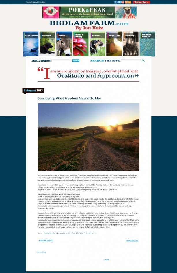
Mannix Marketing has put together what I think is the final header design format for my blog, I like it, we have resolved the questions of size, typeface and line separating the header from the Farm Journal. The one remaining decision I have to make is the color, you’ll see here that (at my request) Mannix has made the top quote line red along with my name, now also in Red and in lower case. The designers are uncertain about the color, I like the Red. It is not perhaps the most aesthetically balanced color match, but I think it has the most impact, it stands out and attracts the eye, it is a stronger, bolder color.
This is the first issue Maria and I have disagreed on, she prefers the blue, but I am pretty clear on liking the Red, the purpose here is to stand out, connect the blog to books. Feel free to weight in. In the morning, I’ll make a final decision and we’ll be done. A series of thematic quotes from me will appear in the header box and fade in and out, I hope to connect the blog to the idea of words, to the notion of a living book, which my blog is becoming. I appreciate the hard work from Mannix, and the great input from so many people.

